Loading...
Administration
Corporate
Development
Introduction Spotfire
Online
Spotfire
Spotfire Administration
Spotfire Development
TIBCO
TIBCO Spotfire
TIBCO Spotfire Online Training
Training
https://tibcospotfireonlinetraining.blogspot.com/2015/05/introduction-spotfire.html
Spotfire TIBCO
Spotfire makes it simple for you to access, analyze and create dynamic reports
on your data. It delivers instant value whether you are a market canvasser, a
sales representative, a scientist or a process engineer by letting you quickly
identify trends and patterns in your critical business data. Spotfire can
access data in a number of places such as on your desktop or in a network file
system. It can even access your data if it is located in remote databases, without
you having to involve your IT department each time you wish to ask a new query.
Spotfire lets you filter your data interactively, and gives you answers
instantly. It also lets you quickly create clear and concise, yet smooth and
colorful visualizations in the form of bar charts, cross tables, scatter plots
and many more valuable tools that will help you respond to events that affect
your business. And finally, Spotfire lets you share your results. Static
reports can be limiting to good business in this fast-paced world of data, and
Spotfire allows you to create dynamic reports that help you to ask new
questions, as well as be able to quickly turn your reports into instant
presentations to show to your colleagues and clients.
The
User Interface
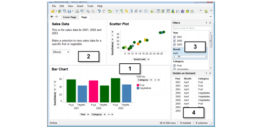
The image below shows some of the major
parts of the TIBCO Spotfire user interface
Visualizations
Visualizations
are the key to analyzing data in Spotfire. A diversity of visualization types
can be used to provide the best view of the data:
•
Tables
•
Cross
Tables
•
Bar
Charts
•
Line
Charts
•
Graphical
Tables
•
Combination
Charts
•
3D
Scatter Plots
•
Map
Charts
•
Pie
Charts
•
Scatter
Plots
•
Treemaps
•
Heat
Maps
•
Box
Plots
•
Parallel
Coordinate Plots
•
Summary
Tables
Different types
of visualizations can be shown simultaneously.
They can be
linked to each other, and may or may not be updated dynamically when the matching
filters on the page are manipulated (see below).
Visualizations can be made to reflect many
dimensions of data by letting values control visual attributes such as color,
shape, size, etc.
Text areas
You can type
text in text areas, explaining what is seen in the different visualizations.
This can be particularly useful if you are creating logical applications for
other users. Text areas can also include several different types of controls,
allowing you to filter, do actions or make selections to view particular types
of data, etc.
Filters
By adjusting
filters, you can reduce the data seen in the visualizations to "drill
down" to the things that interest you. Filters are powerful tools that rapidly
let you see various aspects of your data and make discoveries. Filters appear
in several forms, and you can select the type of filter device that top suits
your needs (for example, check boxes, sliders, etc). When you manipulate a
filter by moving a slider or by selecting a check box, all linked
visualizations are immediately updated to reflect the new selection of data. By
default, all new visualizations on a page will be limited by the filtering
scheme used on the page. However, the filtering system can be changed for each
visualization separately.
Details-on-Demand
The
Details-on-Demand window can be used to show the correct values of a row or a
group of rows. By clicking an item in a visualization, or marking several items
by clicking and dragging with the mouse around them, you can see the numerical
values and textual data they represent immediately in the Details-on-Demand window.
Administration,
Corporate,
Development,
Introduction Spotfire,
Online,
Spotfire,
Spotfire Administration,
Spotfire Development,
TIBCO,
TIBCO Spotfire,
TIBCO Spotfire Online Training,
Training
Training
4143599171533259925
Post a Comment Default Comments Facebook Comments
Home
item
Blog Archive
Popular Posts
-
Three major core components of the Client-Server architecture of TIBCO Spotfire are 1. TIBCO Spotfire Professional 2. TIBCO...
-
1. What is TIBCO Spotfire? Spotfire’s Enterprise Player, when combined with Core Lab’s RAPID database, allows our clients to per...
-
1. If i want to see the outlier which visualization i need to use? Ans : Scatter plot. 2. Are you able to edit the marking, the nam...
-
Spotfire TIBCO Spotfire makes it simple for you to access, analyze and create dynamic reports on your data. It delivers instant valu...
-
To enable recovery after a crash or disaster in your Spotfire system, it is important that information stored in the system is backed ...
-
Only with TIBCO Spotfire . Self-service analytics software designed to authorize every individual in your organization with data-...


